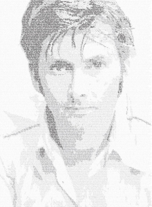
Where do I even begin to explain the reason behind this massive undertaking? Before you, you can see the final product of a 22 hour project that I’ve done in the past two days. It looks gorgeous does it not.
The printed version is much more dynamic than the screen copy. The blacks are so much richer and it is 11″ by 15″ instead of 300px by 500px (or something close to that). The fonts are Gill Sans Light, Gill Sans MT Regular, Gill Sans Bold, and Gill Sans Ultra Bold Condensed. I figured it was appropriate since the font is British. (I’m a little lacking in the sleep at the moment so please forgive any lame comments). The type itself is five point and contents quotes by David Tennant himself.
This whole process was an experience. The image you see before you only took 11 hours (nearly straight, breaks only for necessities) but I had a version before that I had to scrap. I thought I was going to go crazy there for a bit. So many words and too much variations in the image. I think this was the first and only time I ever wished that David was bald. (I don’t think that now, however.)
I wanted to see what you guys thought of the piece. The next step from here would be sending a printed version to the man himself, simply to thank him for the work he does. It will be a Christmas present.

